-
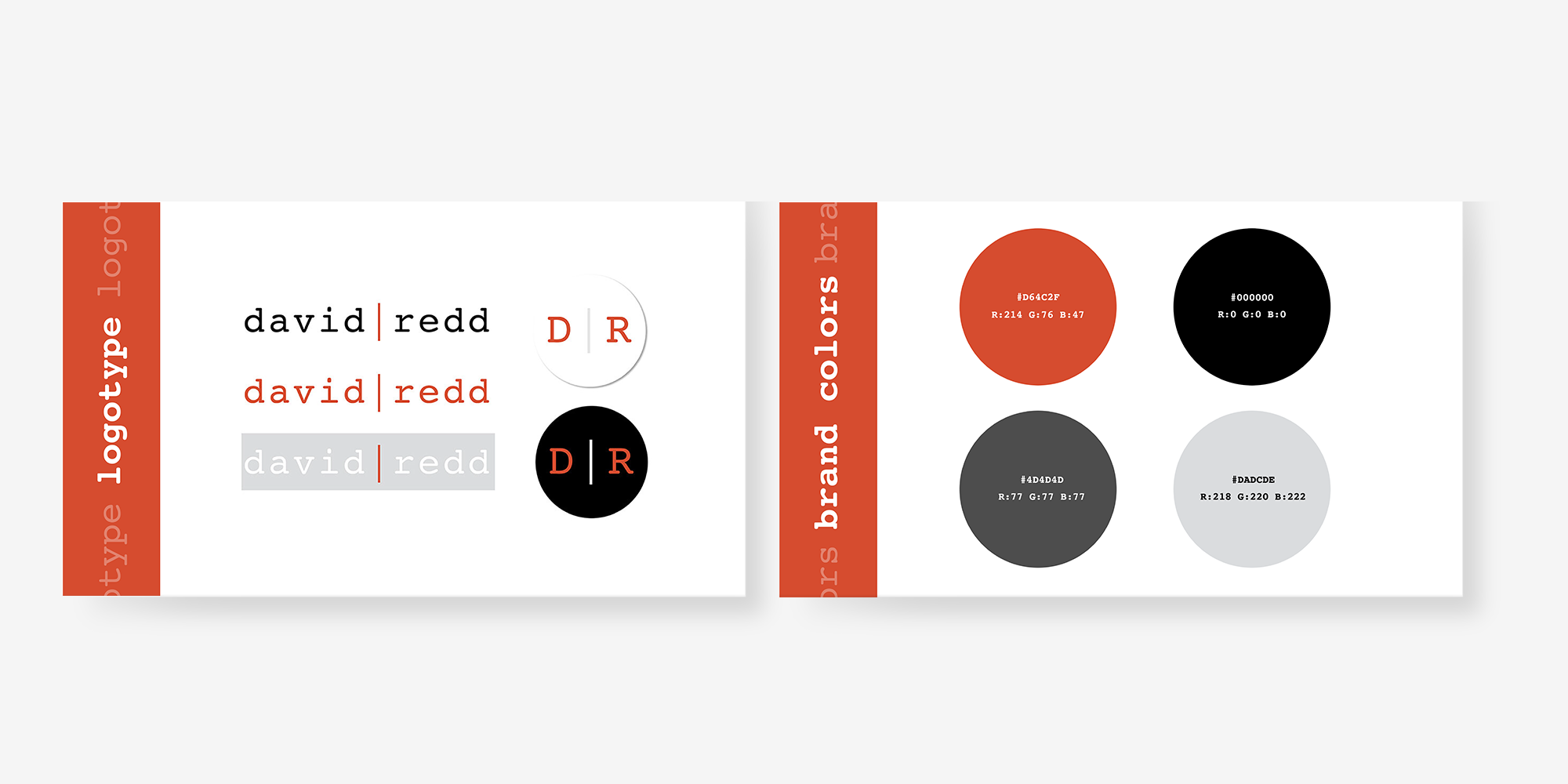
David Redd is an exceptionally talented artist with a unique vision for his work. He aims for a style that is discreet yet dark, cool without veering into dorky, artsy yet grunge, capturing elements of both New York and a hint of Los Angeles.
In considering this aesthetic, I chose to use a courier font to reflect his multifaceted role as a composer, musician, and lyricist. David has often drawn inspiration from literary figures like Hemingway, which led me to think that a typewriter-style font would resonate with him. He was quite enthusiastic about this choice!
For his image treatment, I opted for a collage effect that weaves together different aspects of his life, enhancing the grunge vibe he requested. This approach successfully deepened the overall design, aligning perfectly with his artistic direction.
Street Address
City, State, Zip
+1 (323) 613-0922
portfolio, senior graphic design, illustrator, photographer, artist, digital design, london, uk, hipster
You're Custom Text Here