>1
Orlando Health and Arnold Palmer Hospital For Children
The U.S. News National Recognition 2025-2026 Campaign
-
Growing Up Under the Best Care.
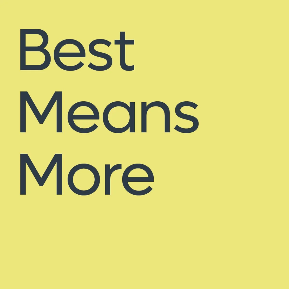
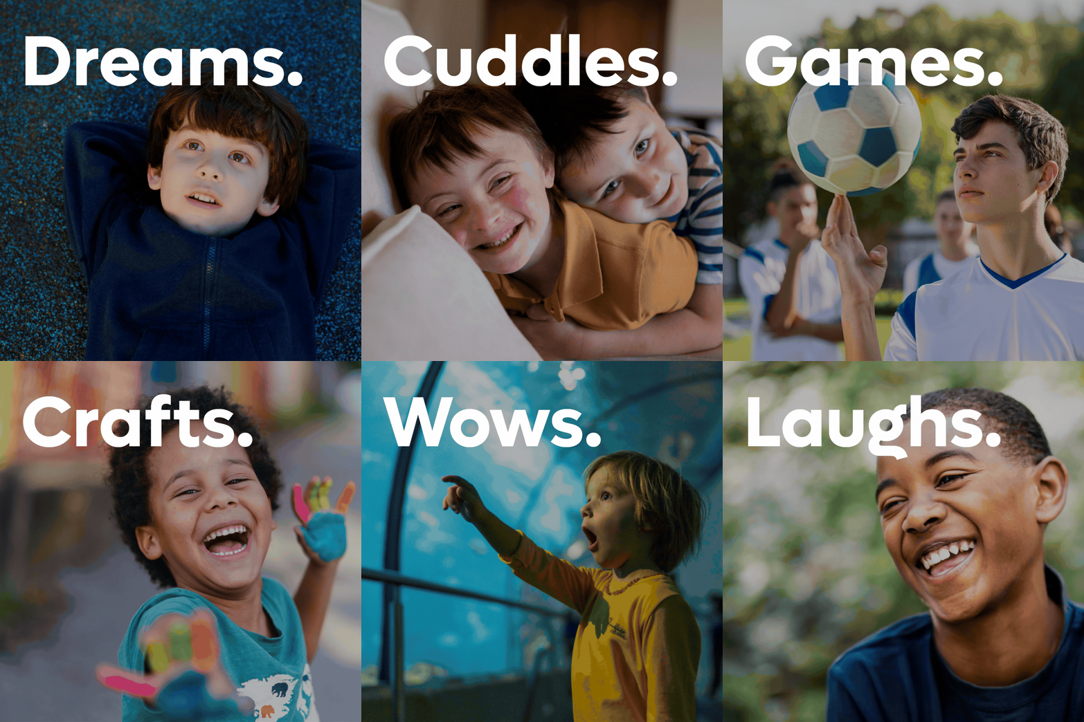
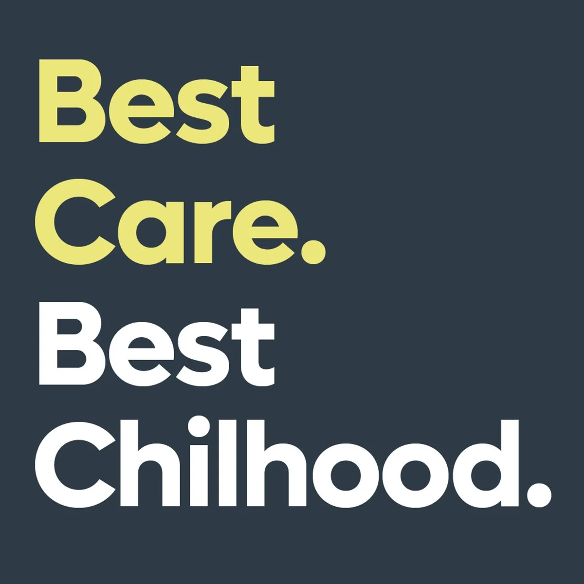
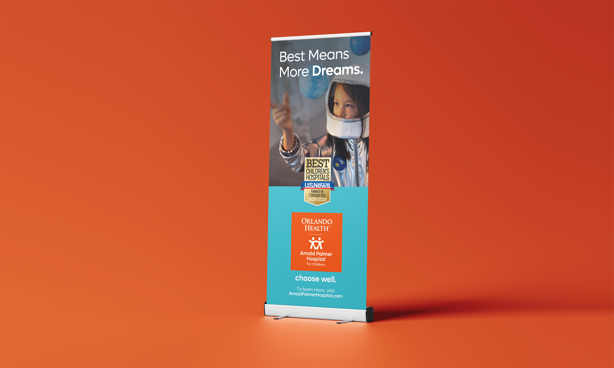
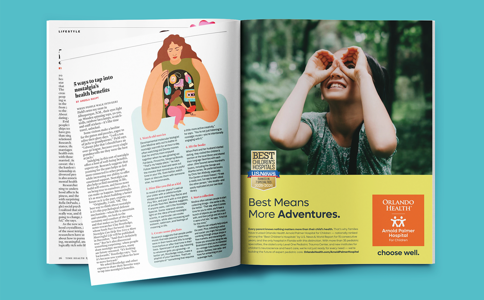
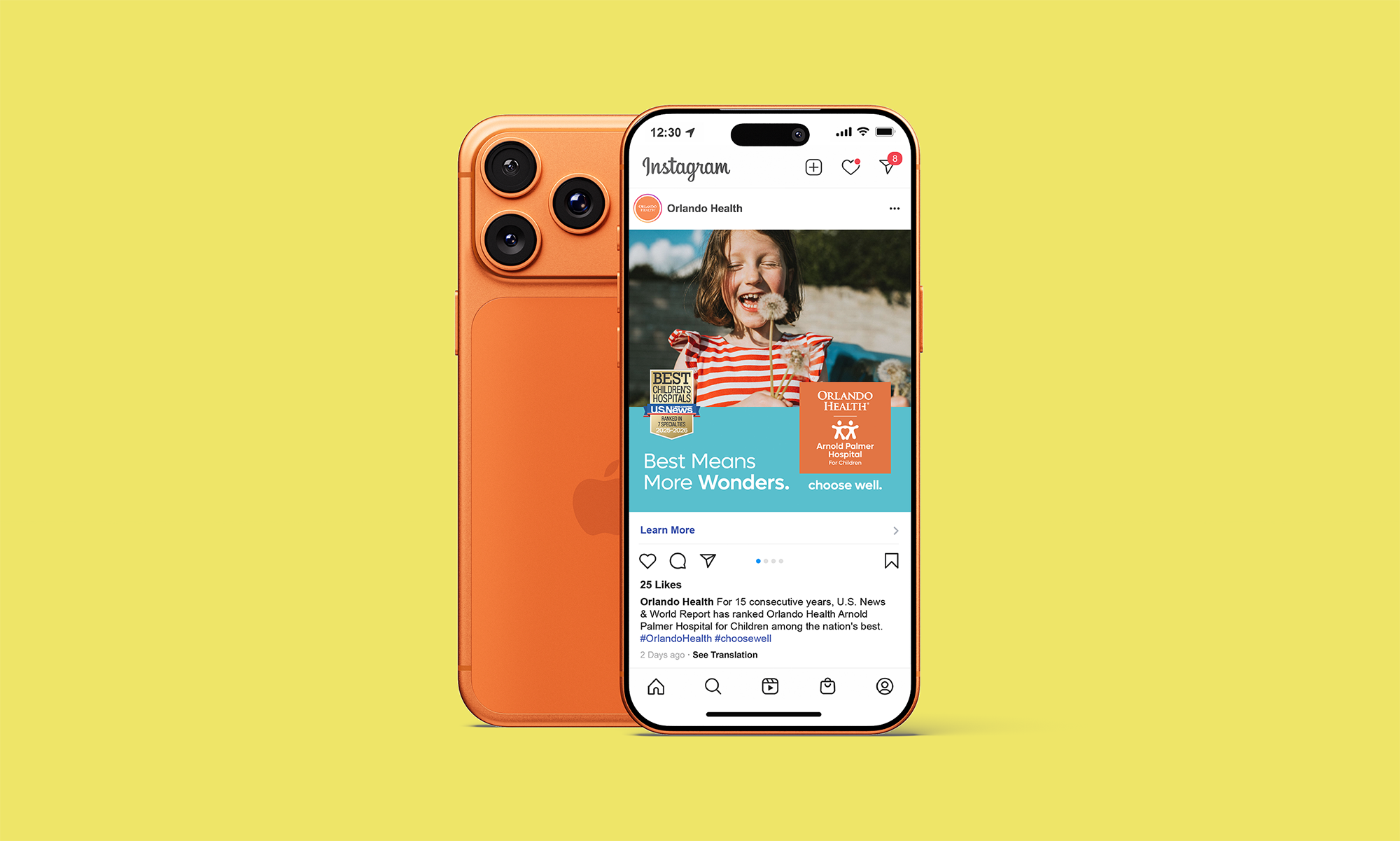
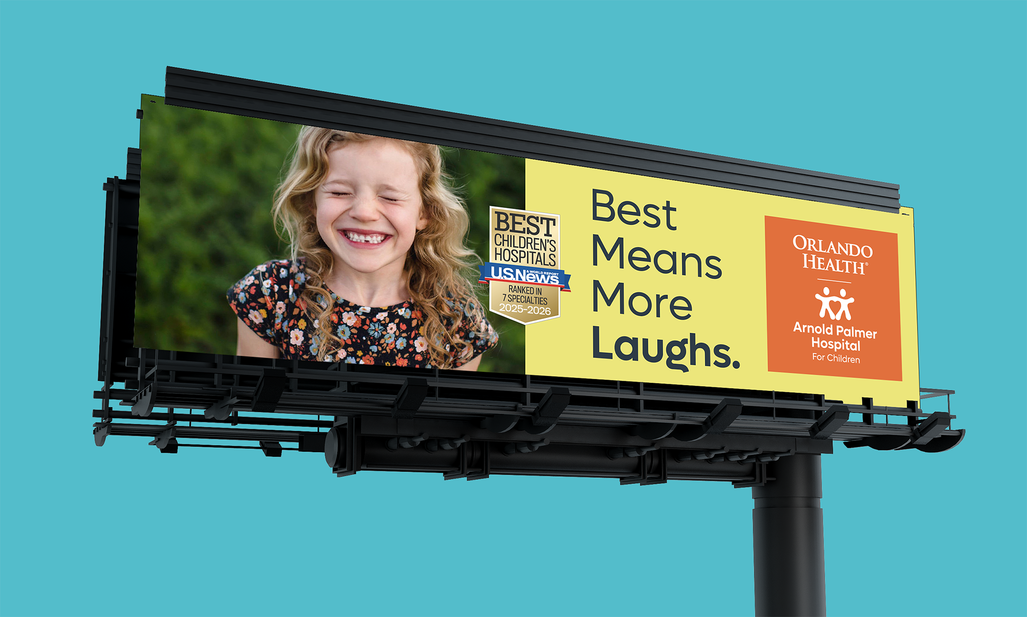
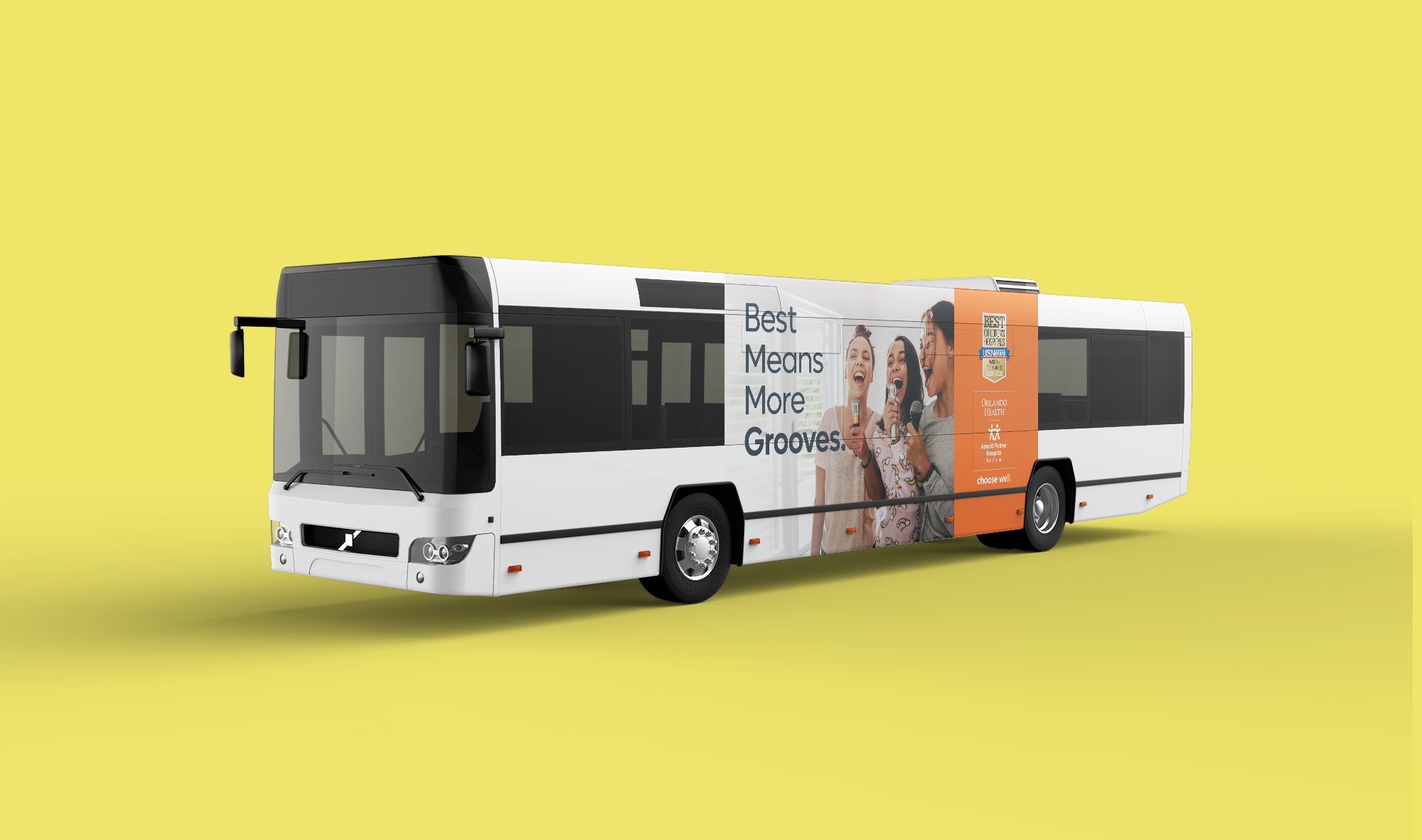
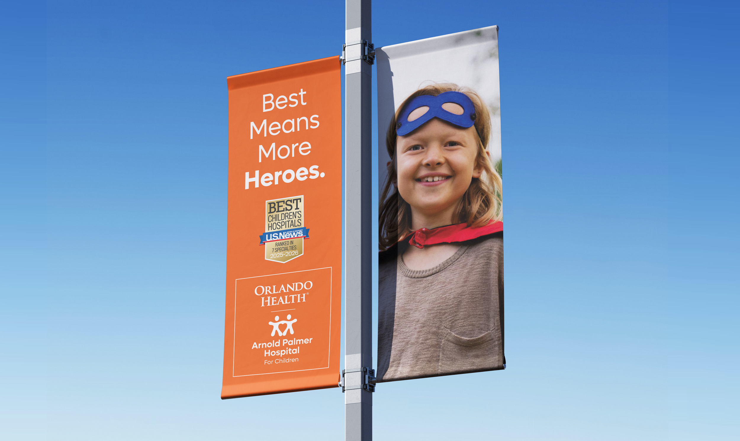
The “Best Means…” platform for Arnold Palmer Hospital for Children connects the hospital’s national recognition with the everyday joys of childhood. For this campaign, I decided to use bright pop colors and joyful, real-life moments to reflect the outcome of exceptional care, where health enables kids to simply be kids. By focusing on expressive, happy imagery, we bring warmth and trust.
Each execution of “Best Means More…” transforms clinical excellence into something tangible: more play, more wonder, more childhood. Together, the visuals and message show that when care is at its best, life opens up in the most meaningful ways.

>2
Orlando Health and the University of Central Florida (UCF)
Official Medical Team for the UCF Football Team Campaign
-
Partners in Every Play.
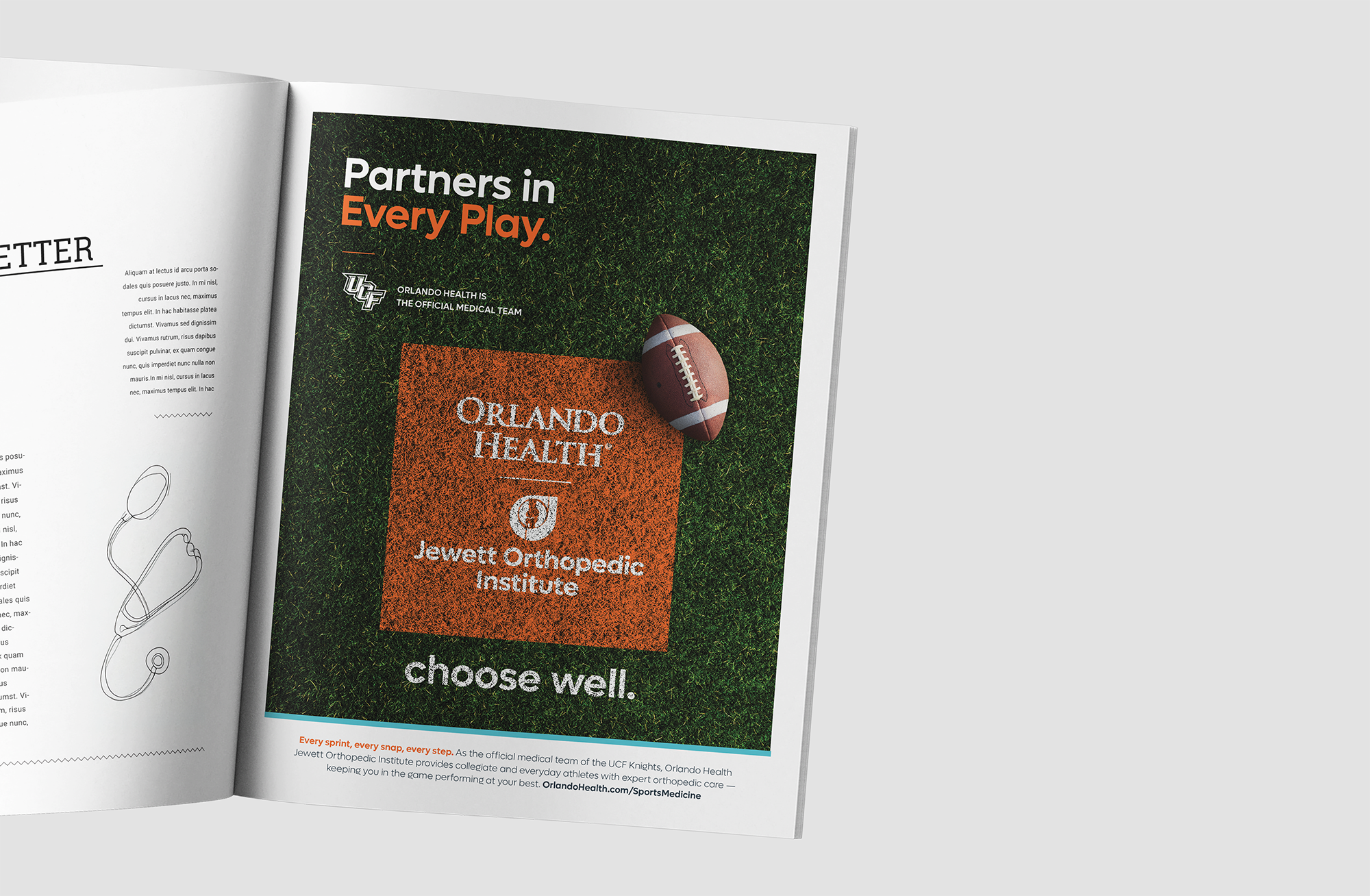
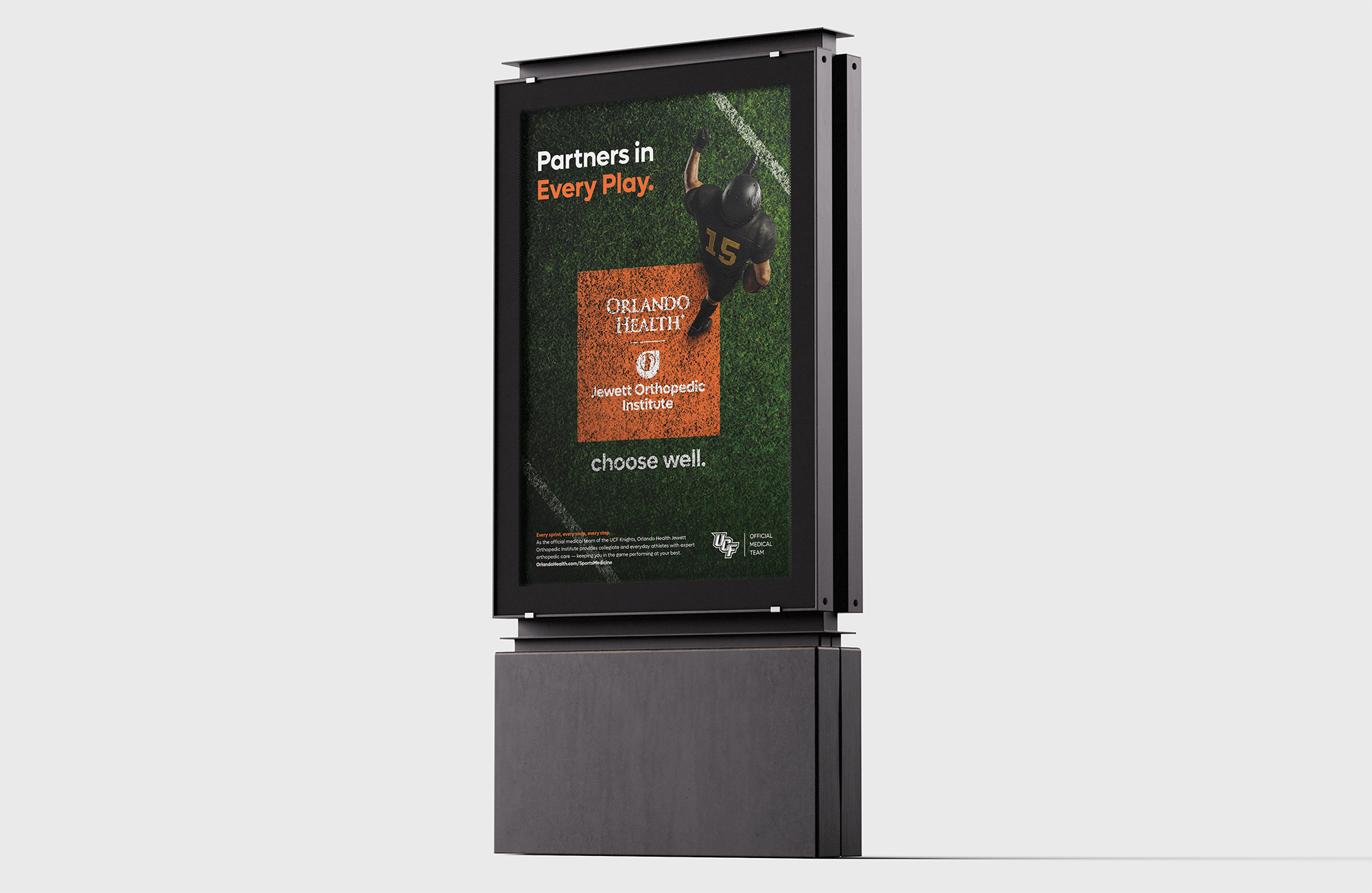
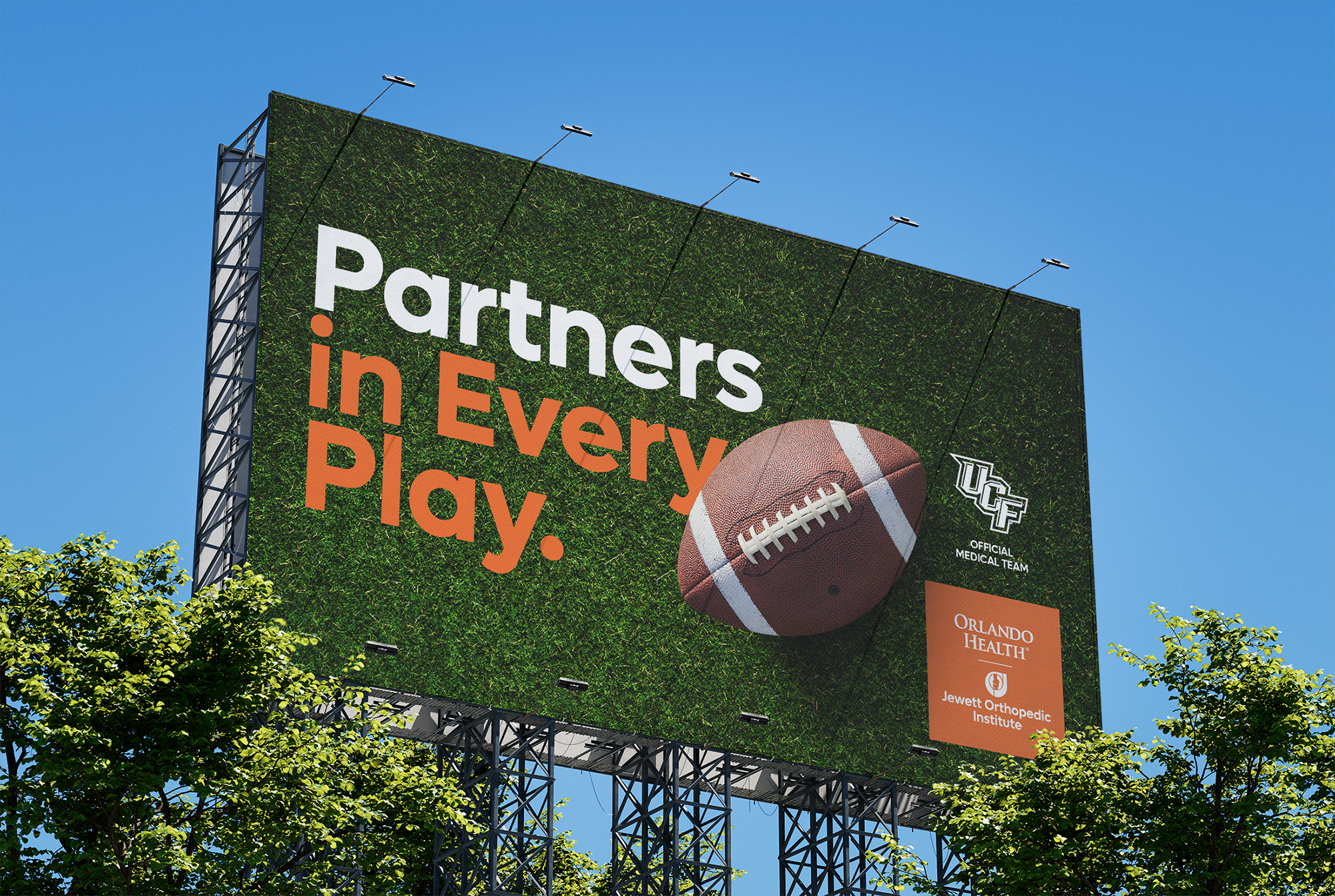
“Partners in Every Play” reinforces Orlando Health’s role as the official medical team of UCF Athletics — a trusted performance partner present in every pivotal moment.
To visually connect healthcare and athletics, the concept integrates Orlando Health directly into the painted field graphics, making the brand part of the game itself. The poster visual features a player stepping onto the field and into the logo, symbolizing the support, protection, and partnership behind every play.
>3
Orlando Health and the Jewett Orthopedic Institute
Complex Knee Surgery Summit 2027
-
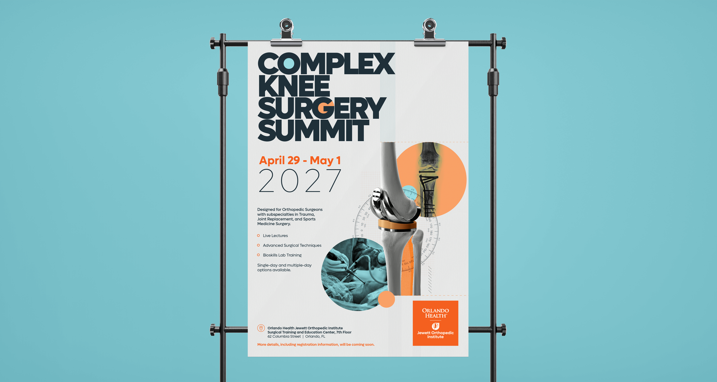
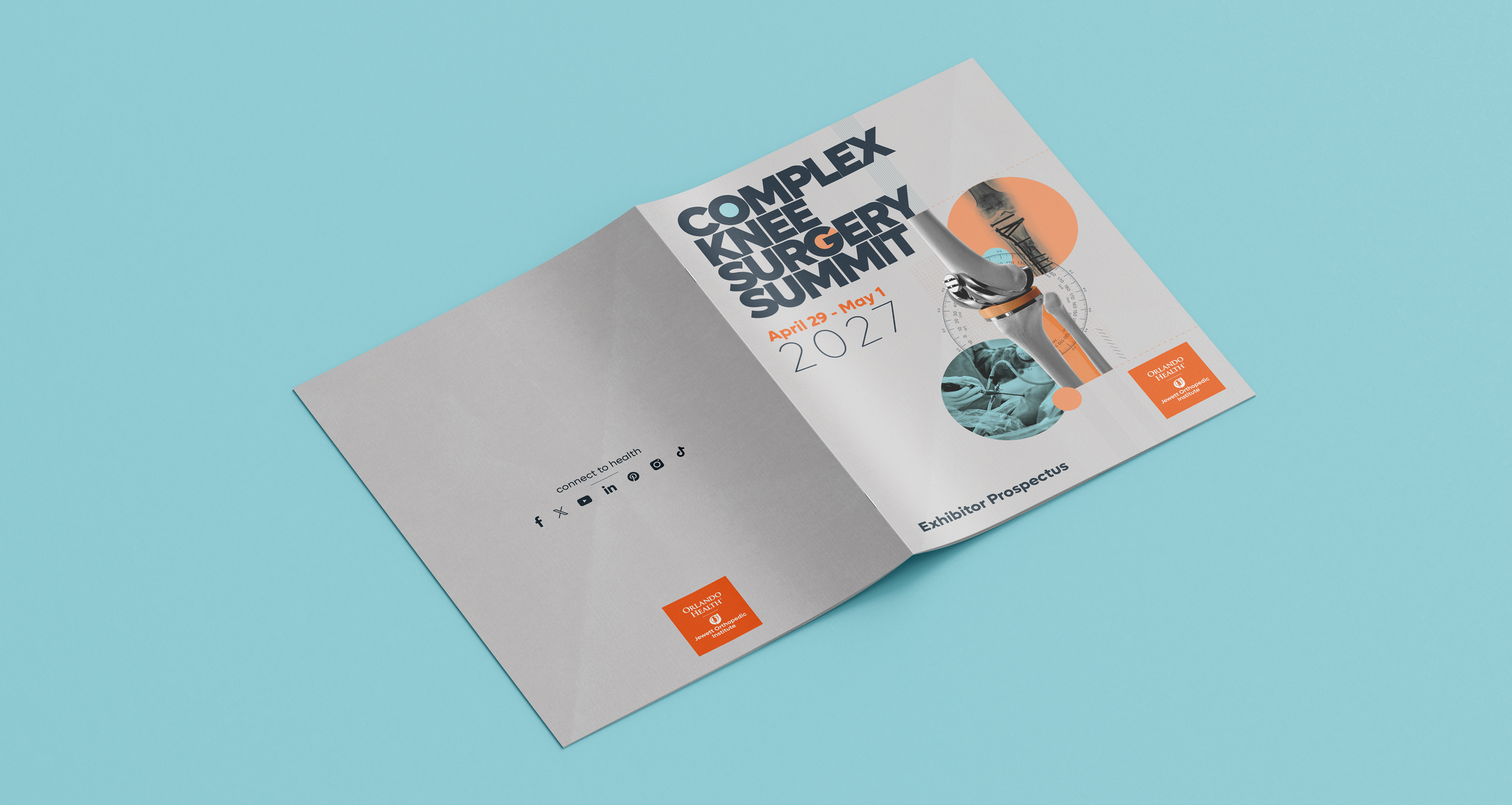
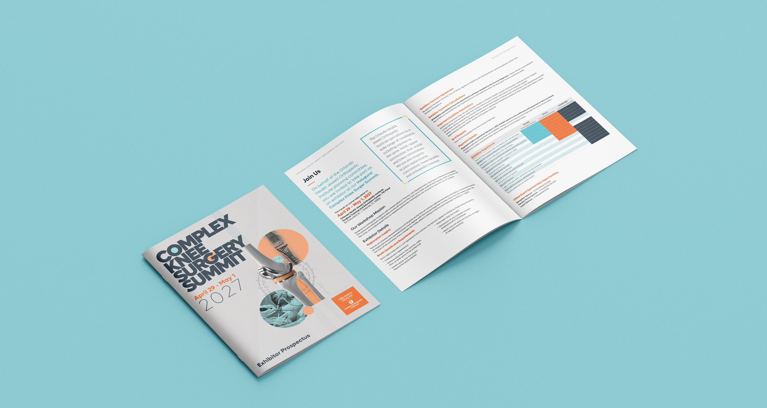
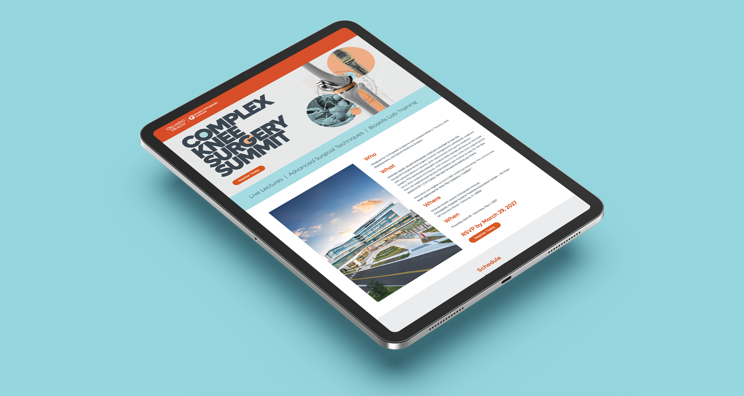
The visual system was designed to communicate the complexity and precision of advanced knee surgery without depicting the procedure itself. By layering radiographic imagery, implant components, surgical instrumentation, and a modernized goniometer illustration, the design creates a contemporary scientific aesthetic that speaks directly to orthopedic specialists in trauma, joint replacement, and sports medicine.
>4
Orlando Health
ER Campaign 2026
-
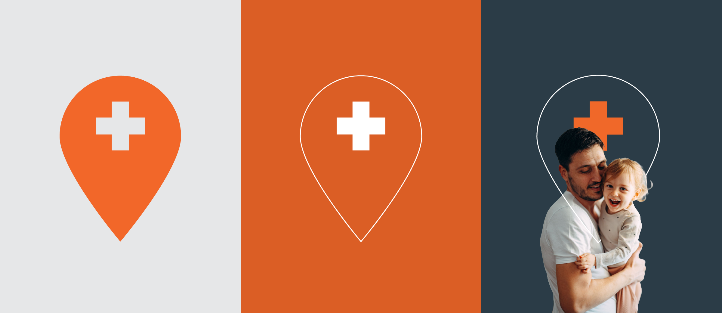
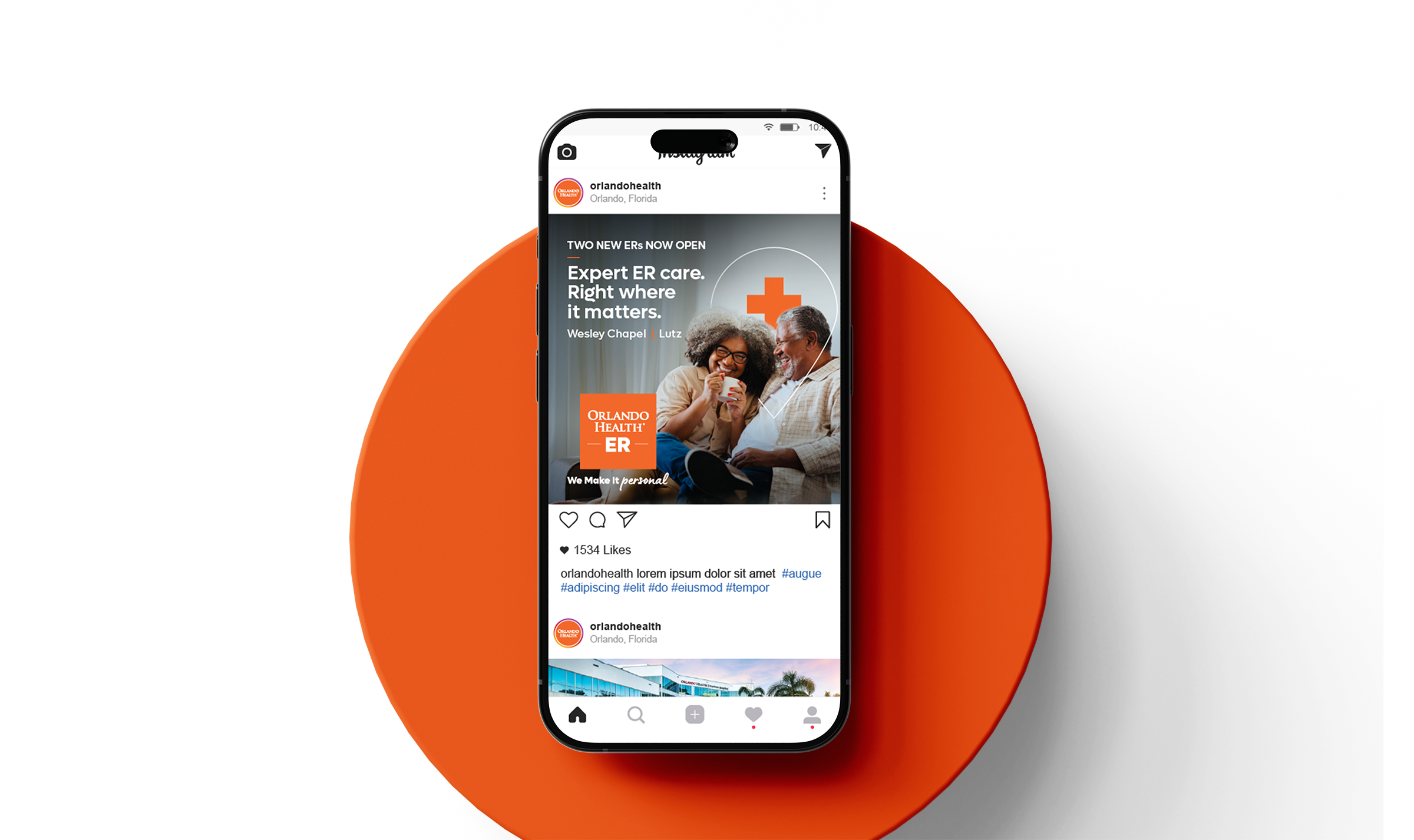
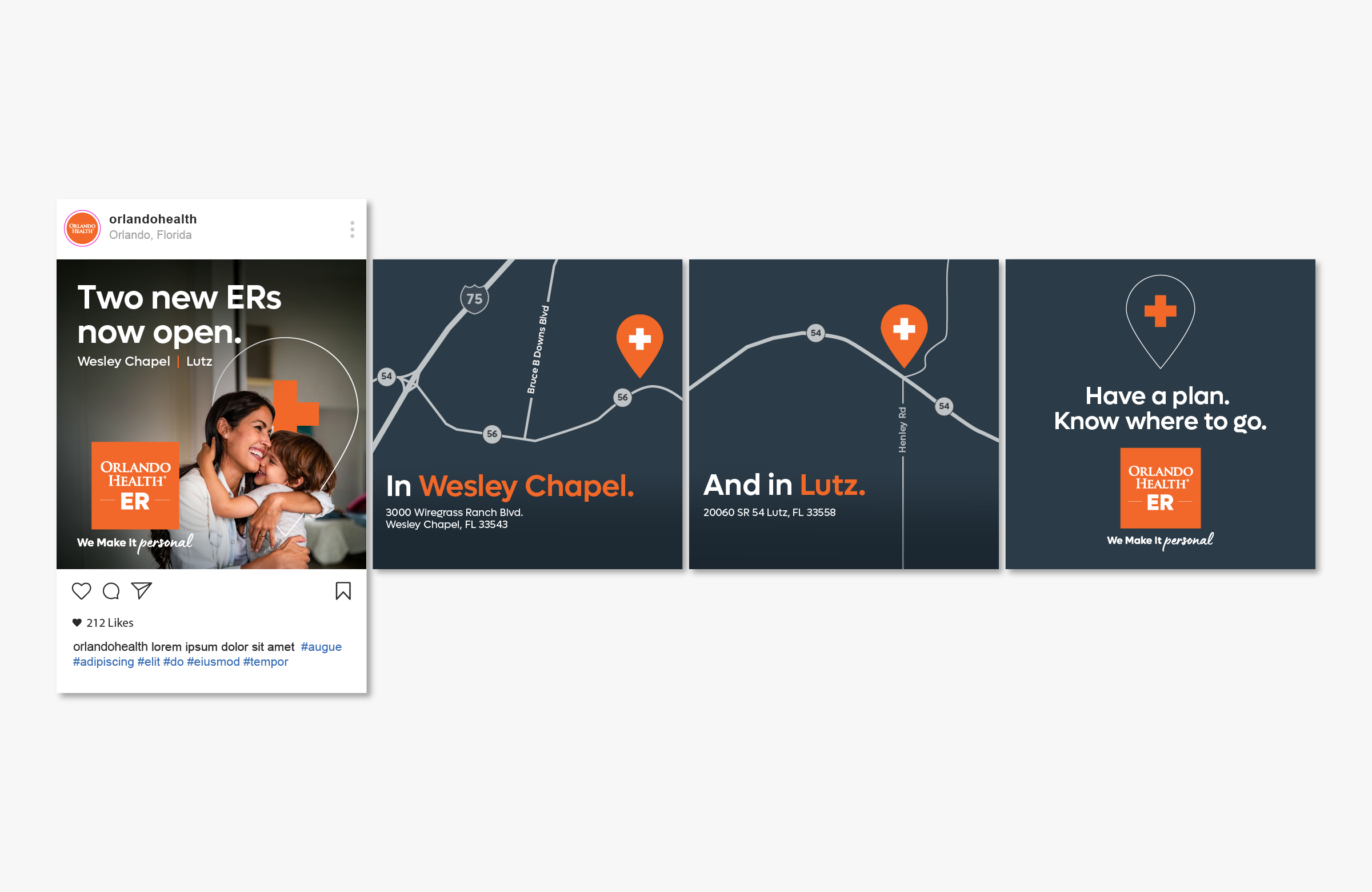
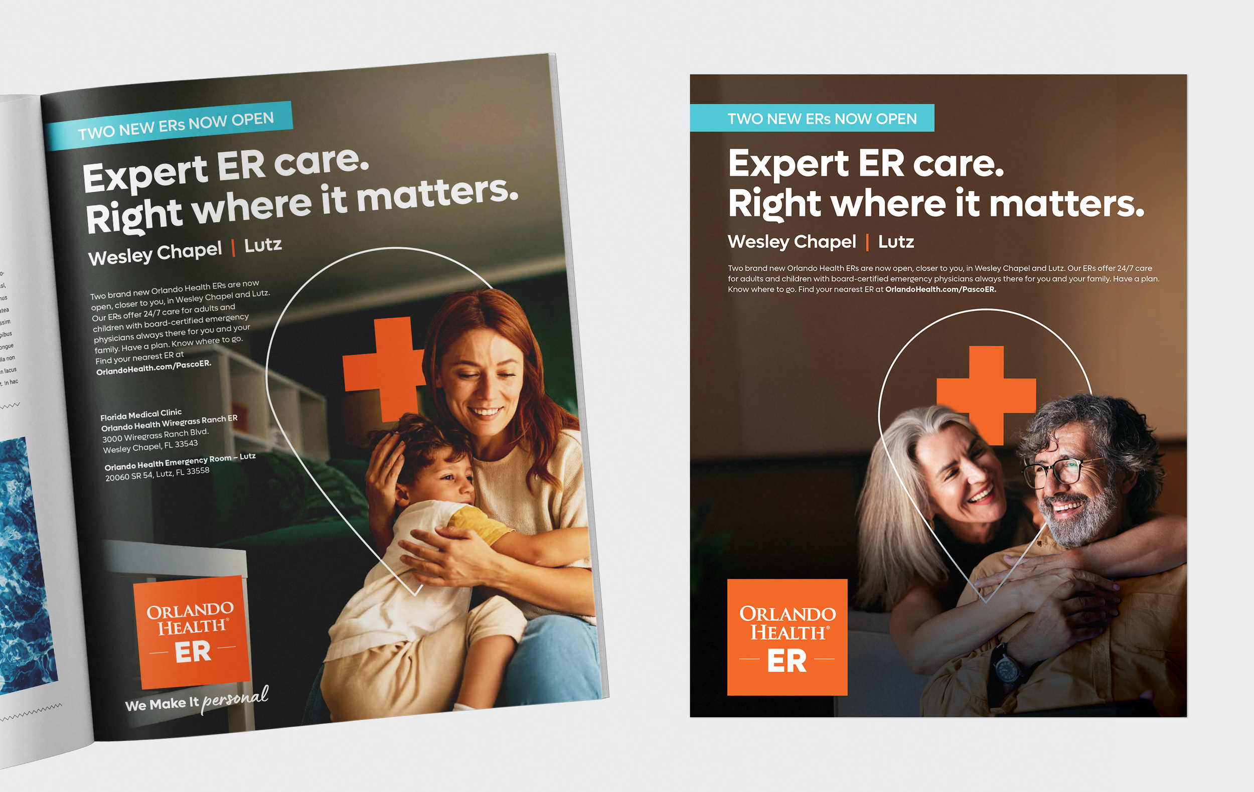
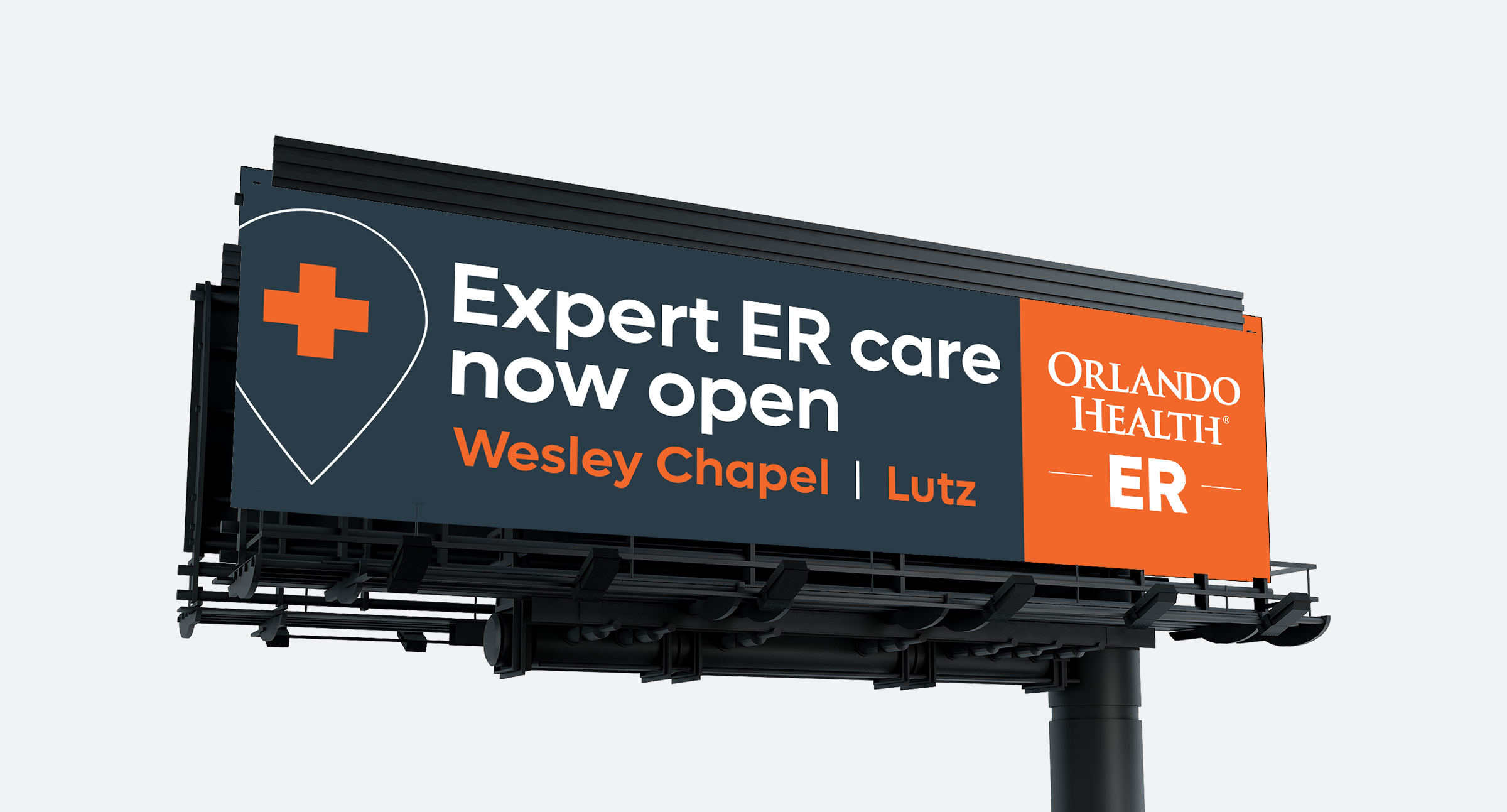
Orlando Health (OH) is opening two new ERs in growing local communities, so we developed the concept “Expert ER Care. All Around You.”
To visually express both proximity and reassurance, I used the OH location-pin icon and wrapped it around the patient, creating a protective embrace that reinforces the idea of expert care being close by and surrounding the families we serve.
By integrating the icon directly into the imagery, we connect place, care, and protection in one simple gesture—making the two new ER locations feel not only conveniently nearby, but personal, familiar, and part of the community.